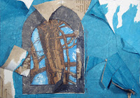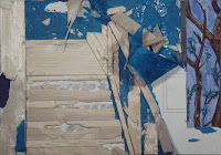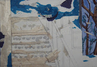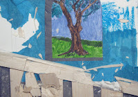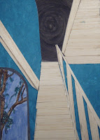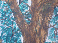
 Navagation of the Atlas was a key componant in our project. My chosen navagation was emotion - and the colours that represent them. Each exercise has a different coloured film strip (which is an element that connects with the film tunnel) that corrolates with the emotion word on the contents page. Navagation of any work is an important factor in taking the observer on a journey of understanding the message you are portraying.
The display layout and the process that led to it was a major element in the Atlas. This method of playing around with text and images on a page so that they commuicate a clear, succinct and connecting theme through visual language will be very helpful in future when expressing complexity of ideas or vision to a client.
 I have learned through precedents such as Luis Barragan that colour plays a huge part in the world of architecture, that you can have just a simple form but when added with colour it can express a whole new phenomenon.

 Barragan was a major influence in how i displayed my atlas. From connecting black and white images with colour to the display method of one big image with two or three underneath that enhance the message being portrayed.


Storyboard of Film Tunnel

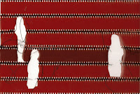

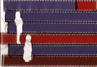
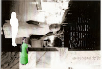
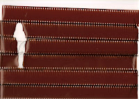
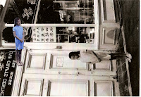 My inspiration for my film tunnel was Sin City. Through doing this exercise i have learnt how to effectively achieve an illusion of spatiality that communicates a story and concept through 3D representation.
Film Tunnel

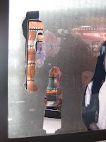


Overall, this workshop has reinforced and taught me many skills that will be useful tools of communication in the future. These incude, an exploration and understanding of color theory and its impact on architecture. 3D crafting skills and how this method effictively communicates a vision or idea. Sketching, painting and drawing of images and how to manipulate these in programs such as Indesign and Photoshop so as to achieve an interesting and creative piece of work.


